Chapter 3 Exploratory Data Analysis
3.1 Longitudinal Analysis
We first examine the time trend of the request number in four years. The graph below shows a seasonality trend in each year, where it increases first, peaks in summer season, then decreases. We can also notice that there is a sharp drop in request number in week 10 to week 15 of 2020. A possible explanation would be the start of Covid-19 which leads citizens to staying at home and making less requests.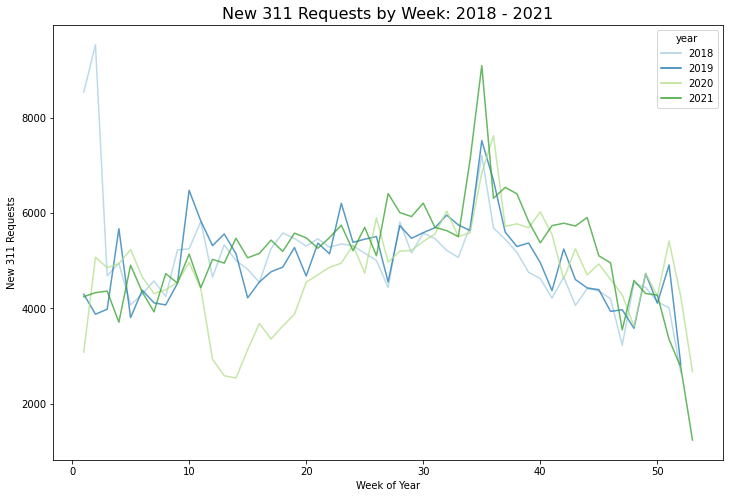
3.2 Distribution Analysis across Neighborhood
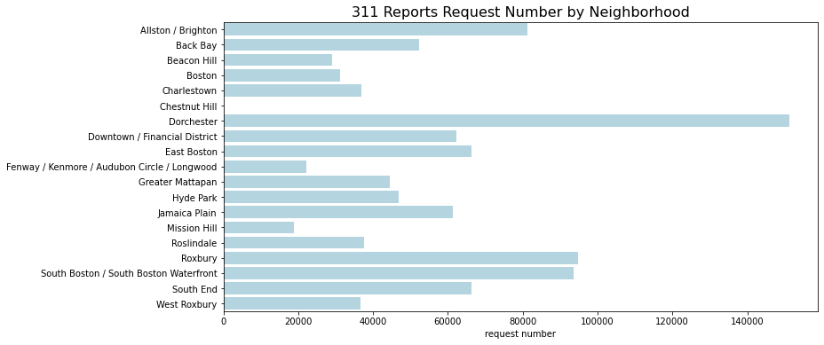
311 Report Request Number in Different Neighborhood
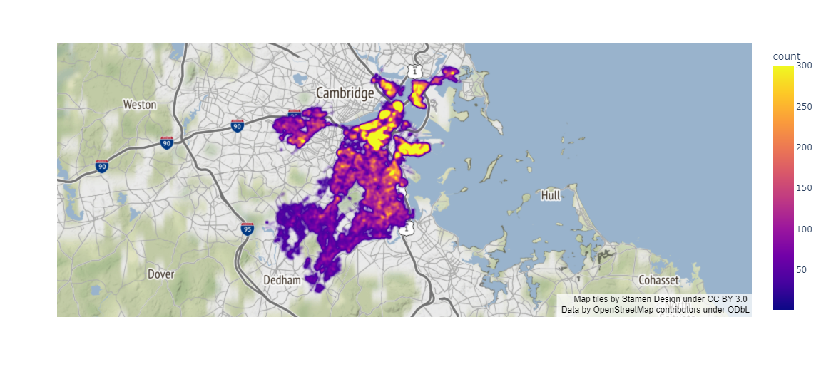
The map intuitively shows that 311 report request numbers vary a lot geographically (see jupyter notebook for interactive version). The northeastern part is yellower than the southwestern part which indicates that citizens in the northeastern part generate more requests than the citizens in the southwestern part. In order to quantitatively compare the request numbers in every neighborhood, a bar plot is further generated. Dorchester is the neighborhood that has the largest number of requests followed by Roxbury and South Boston/ South Boston Waterfront. They are all located in the middle or the northern part of the previous map. In contrast, Chestnut Hill, Mission Hill, and Fenway/ Kenmore/ Audubon Circle/ Longwood are the neighborhoods with lower request numbers. Those neighborhoods are located in the western part.
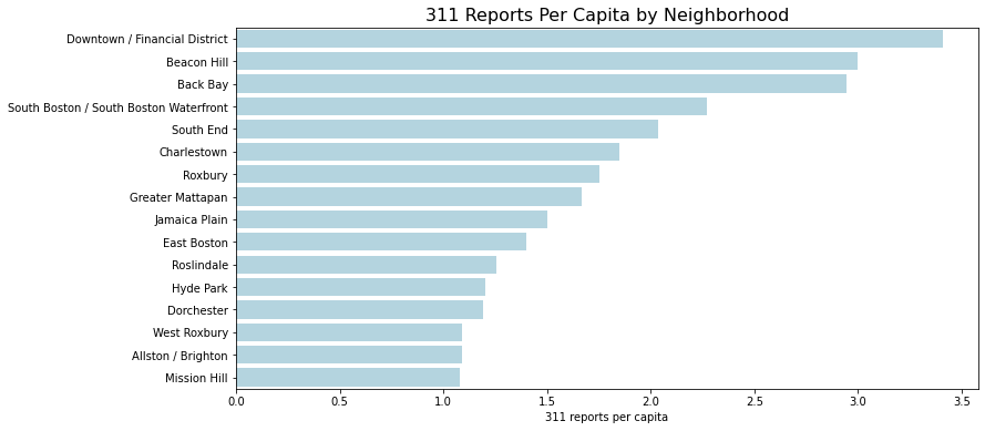
We further normalize the number of 311 Reports by the population of that neighborhood. In all neighborhoods, 311 reports per capita are all greater than 1. Number of requests per capita is the highest in Downtown/ Financial District, followed by Beacon Hill and Back Bay. Misson Hill, Allston/ Brighton, and West Roxbury have relatively low request number per capita. Dorchester, which has the highest request number, does not have high report number per capita.
311 Requests by Different Channels across Neighborhood
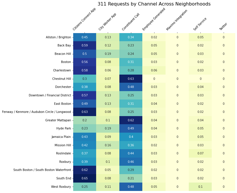
There are six channels that citizens could use to report their requests. After grouping the requests by neighborhoods, heatmap is used to show the distribution of number of requests from different channels. The graph shows that there are slightly difference in the distribution of channels of different neighborhoods. Though the most commonly used channels are Citizens Connect APP and 311 phone calls, most neighborhoods (e.g. Back Bay, South Boston/ South Boston Waterfront) use APP more often, but there are still several neighborhoods (e.g. Chestnut Hill, Greater Mattapan) that use phone call more often.
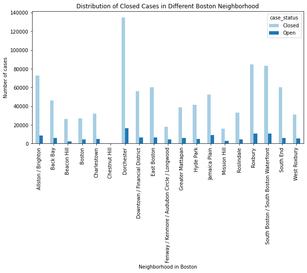
Distribution of Close Cases in Different Boston Neighborhoods
Most neighborhoods have close rate higher than 85%. Fenway/ Kenmore/ Audubon Circle/ Longwood is the only neighborhood has close rate (81.21%) lower than 85%. Beacon Hill has the highest closed rate (91.55%), followed by South End (91%) and East Boston (90.37%).
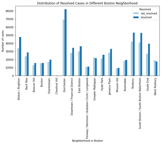
Distribution of Resolved Cases in Different Boston Neighborhoods
From the graph above, Greater Mattapan and West Roxbury are the two neighborhoods with non_resolved case numbers higher than resolved case numbers which indicates the resolved rate is lower than 50%. Among the other neighborhoods, South End (59.44%) and Alluston/ Bringhton (58.57%) have relatively high resolved rate; whereas, Fenway / Kenmore / Audubon Circle / Longwood (51.01%), Mission Hill (51.46%) and Boston (50.67%) have relatively low resolved rate.
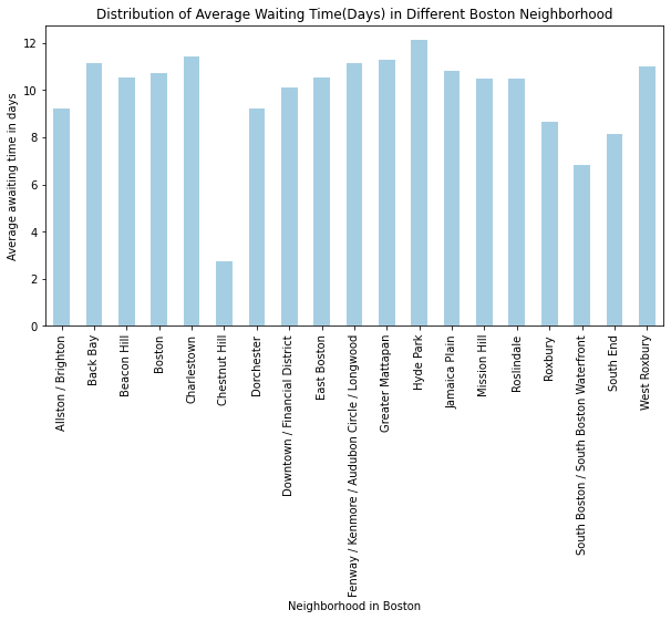
Distribution of Average Awaiting Time in Different Boston Neighborhoods
On average, people need to wait at least a week for a case to be closed except in Chestnut Hill. This might due to the extreme low number of cases which bias could be introduced. South Boston/ South Boston Waterfront, South End, and Roxbury have relatively short waiting time compared to Hyde Park, Charlestown, and West Roxbury where people need to wait longer.
3.3 Demographic Analysis
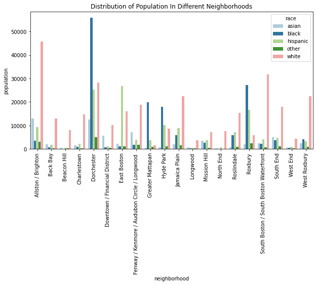
Race Distribution
Race distribution of each neighborhood is significantly different. Black is dominant in Dorchester, Hyde Park, Greater Mattapan, and Roxbury ; whereas White is dominant in South Boston/ South Boston Waterfront, South End, Jamaica Plain, and Allston/ Brighton. East Boston is the only neighborhood that Hispanic has the largest proportion.
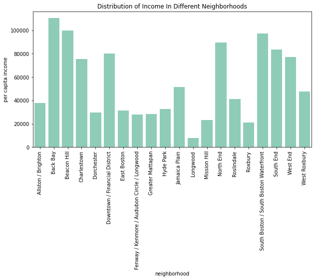
Income Distribution
Per capita Income is significantly different in each neighborhood. The per capita income of Back Bay is the highest, and it is the only neighborhood having per capita income larger than 100,000. The per capita income of Beacon Hill and South Boston/ South Boston Waterfront are also relatively high. The per capita income of Longwood, Roxbury and Mission Hill are lower than 25,000 which are the lowest among all neighborhoods.
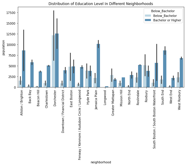
Education Level Distribution
Distribution of education level is different from each neighborhood. For easy visualization and comparison, education level is further categorized to two categories - “below bachelor” and “bachelor or higher”. The proportion of’ bachelor or higher’ is higher than ‘below bachelor’ in the majority of neighborhoods except for Hyde Park, East Boston, Greater Mattapan, and Roxbury. Though the proportion of people with “bachelor or higher” degree is higher in Dorchester and East Boston, the proportion differences between these two groups are small.
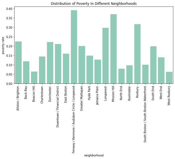
Poverty Distribution
Distribution of poverty rate is different in each neighborhood. Ferway/ Kenmore/ Audubon Circle/ Longwood is the neighborhood with the highest poverty rate (39.2%), followed by Mission Hill, Roxbury and Longwood. All of these neighborhood have porverty rate larger than 25%. On the other side, West Roxbury has the lowest poverty rate (6.3%), followed by North End and Beacon Hill. The poverty rate of these neighborhoods are all lower than 8%.